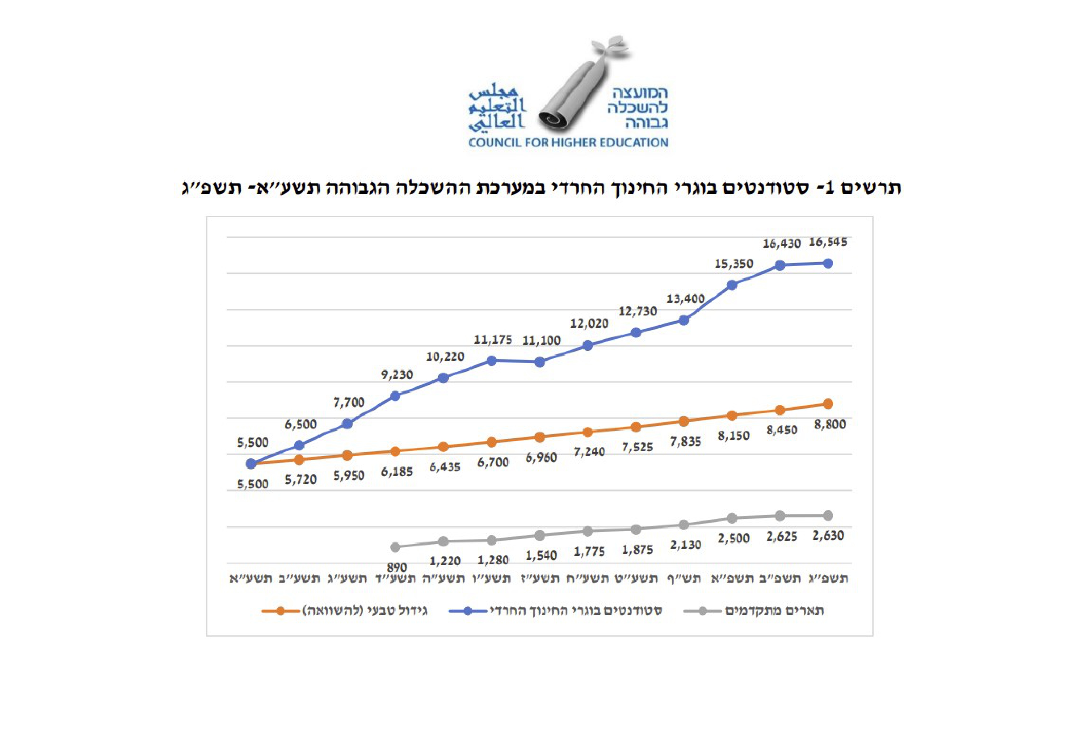
WRONG!
Indeed:
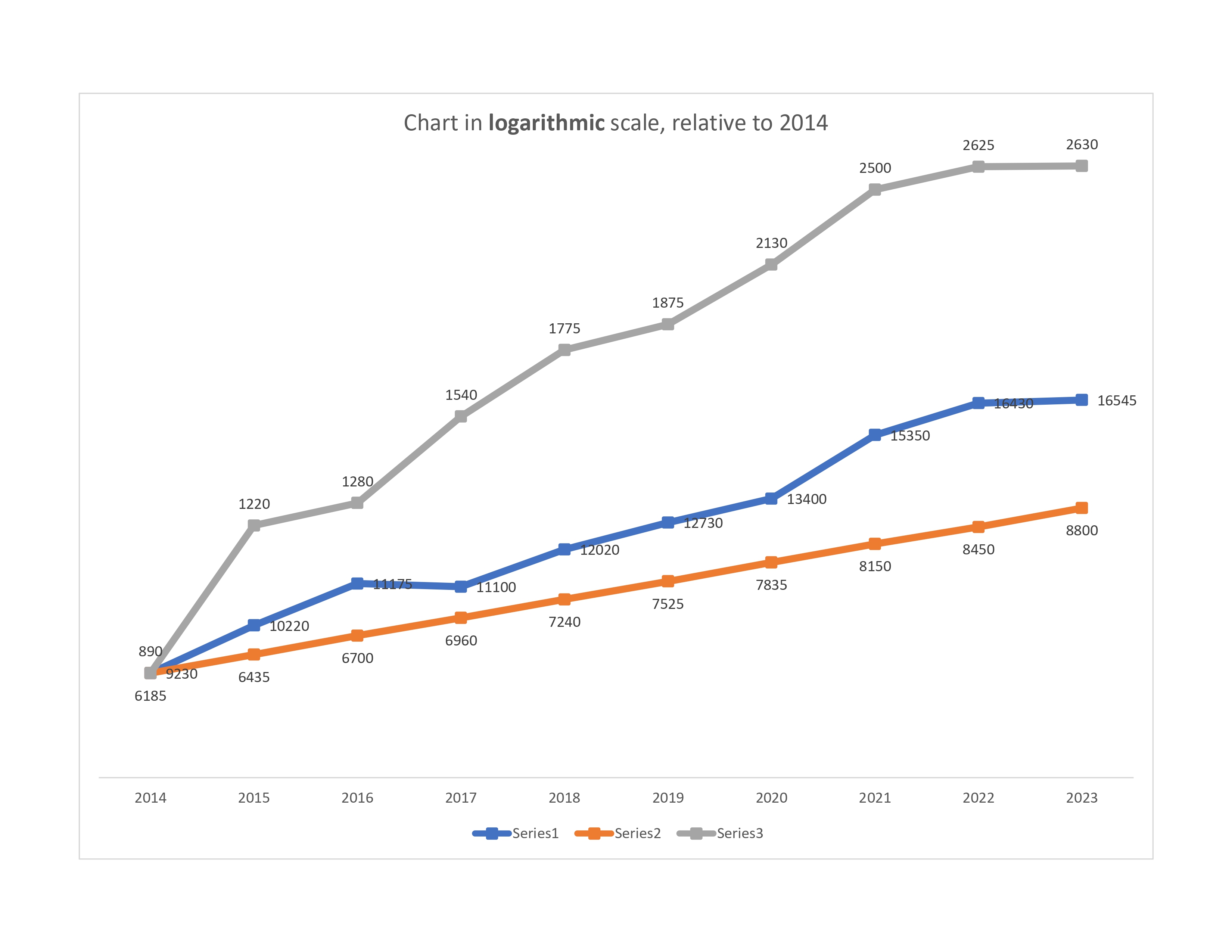
To see this, we show the same data (starting from 2014) but now charted in a LOGARITHMIC scale, which shows correctly the relative changes:

The document's position is that one should extend sex segregation in high education, whose effect may be seen in the blue line, to higher degrees, because there is a lag there, as seen in the gray line. However, the reality is that the gray line has increased much more than the blue line, and did so without sex segregation.
Draw your own conclusions on whether the manipulation of data presentation
in order to support
one's position was done on purpose ...
One thing to note here is that the
orange line,
which is only a
theoretical comparison line, is linear in the logarithmic scale (but
not in the linear scale) -- as
it should be. Thus whoever prepared this chart is aware that
changes over time ("time series") are shown by ratios, that is,
in the logarithmic scale.
-----------------------------
Here are two charts again, side by side:


Last updated:
| GO TO
Sergiu Hart's |
E-MAIL: hart@huji.ac.il |
| Main Menu |